Client
Bloom
Services
Brand Identity
Brand Language
Social Media Extension
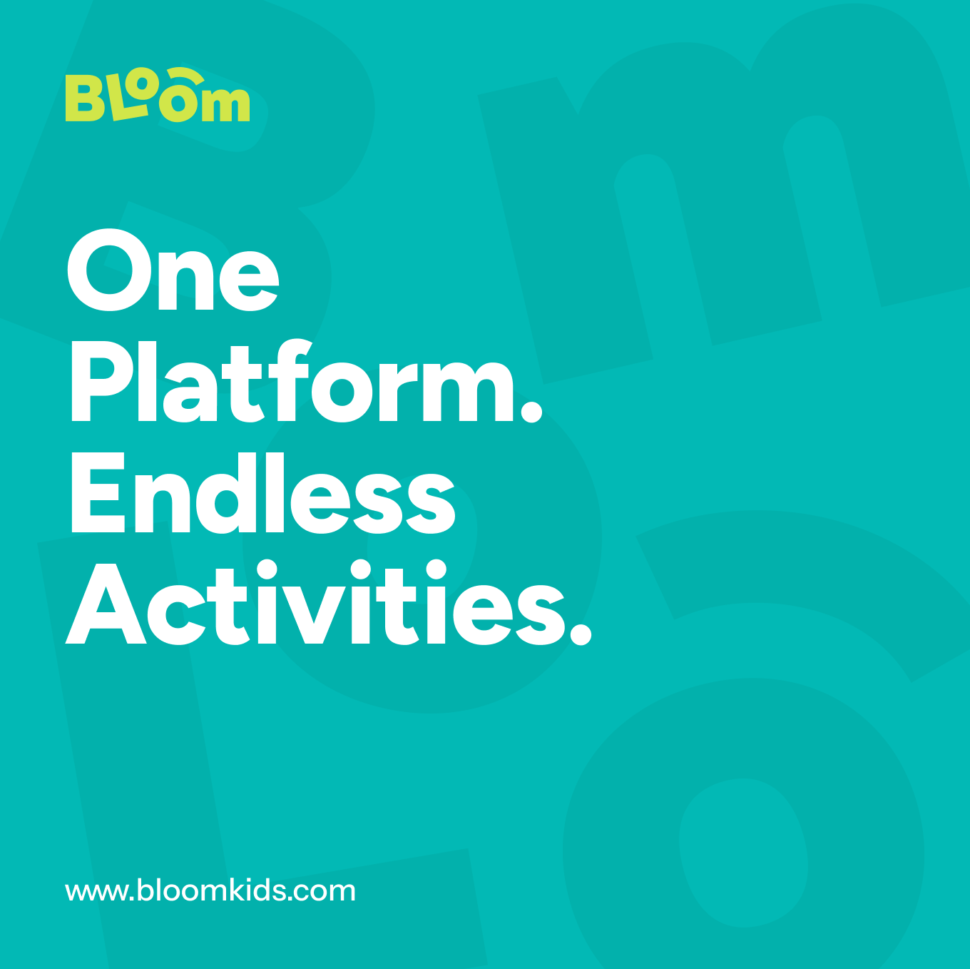
Building a joyful, trusted platform for modern parenting.
Overview :
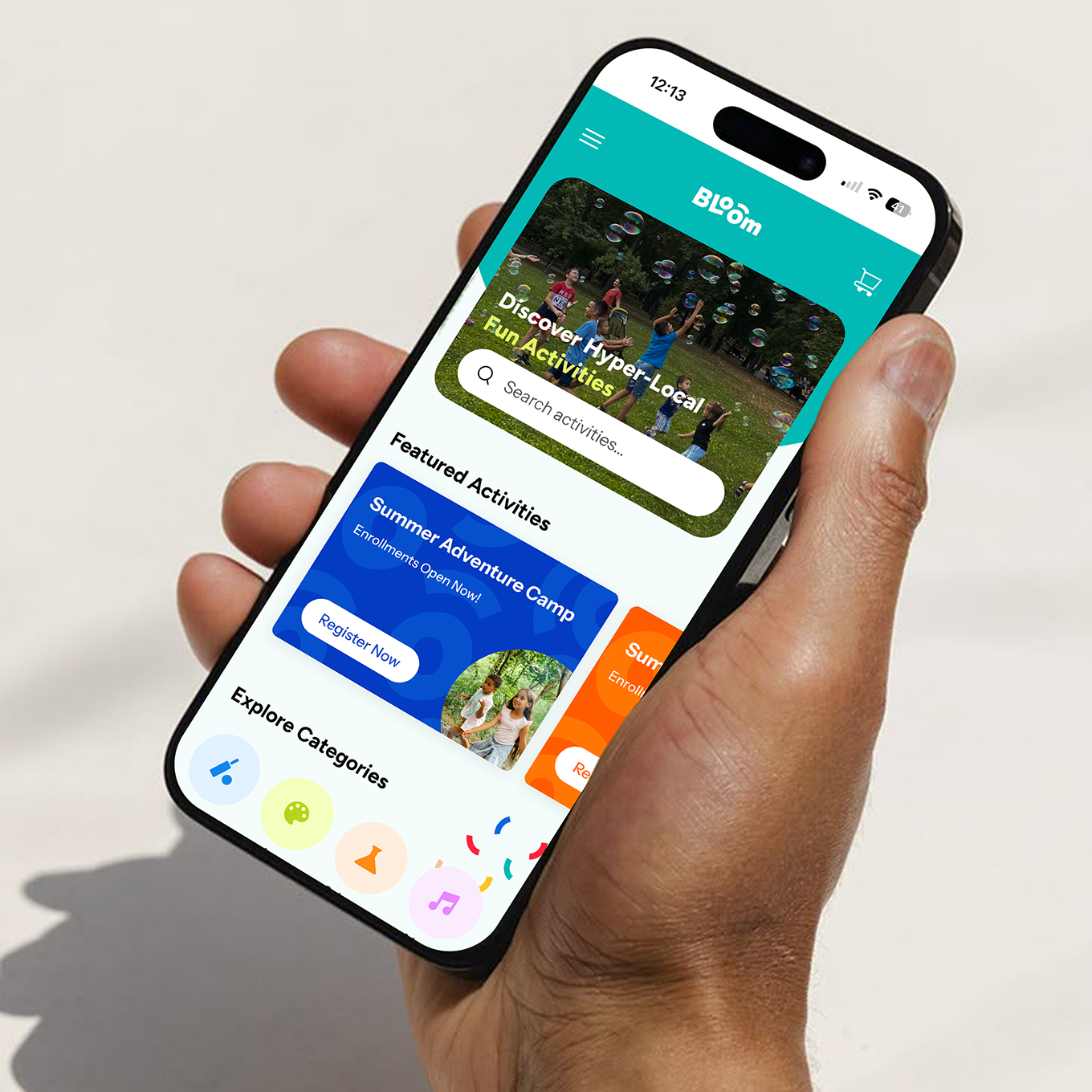
Bloom is a hyper-local platform that helps parents discover and book extracurricular activities, classes, and events for children. Born from a personal insight — the overwhelming challenge of finding trusted, nearby options for kids. Bloom simplifies the journey by bringing everything into one joyful, parent-friendly space.
Our studio partnered with Bloom to craft a brand that feels fresh, intuitive, and full of warmth. From visual identity to collateral and social media extensions, the goal was to create a system that reflects the brand’s core values: curiosity, clarity, and community.
Our studio partnered with Bloom to craft a brand that feels fresh, intuitive, and full of warmth. From visual identity to collateral and social media extensions, the goal was to create a system that reflects the brand’s core values: curiosity, clarity, and community.
Building a joyful, trusted platform for modern parenting.
Overview :
Bloom is a hyper-local platform that helps parents discover and book extracurricular activities, classes, and events for children. Born from a personal insight — the overwhelming challenge of finding trusted, nearby options for kids. Bloom simplifies the journey by bringing everything into one joyful, parent-friendly space.
Our studio partnered with Bloom to craft a brand that feels fresh, intuitive, and full of warmth. From visual identity to collateral and social media extensions, the goal was to create a system that reflects the brand’s core values: curiosity, clarity, and community.
Our studio partnered with Bloom to craft a brand that feels fresh, intuitive, and full of warmth. From visual identity to collateral and social media extensions, the goal was to create a system that reflects the brand’s core values: curiosity, clarity, and community.
Client
Bloom
Services
Brand Identity
Brand Language
Social Media Extension
(BRAND identity)
The Bloom brand strikes a balance between playful and practical. It’s rooted in trust, but always leaves room for imagination — just like the experiences it promotes.The design system uses soft yet confident typography, a vibrant colour palette, and friendly forms to communicate approachability. Every element is designed to feel clear and intuitive for parents, while still capturing the joyful energy of childhood.
(visual identity)
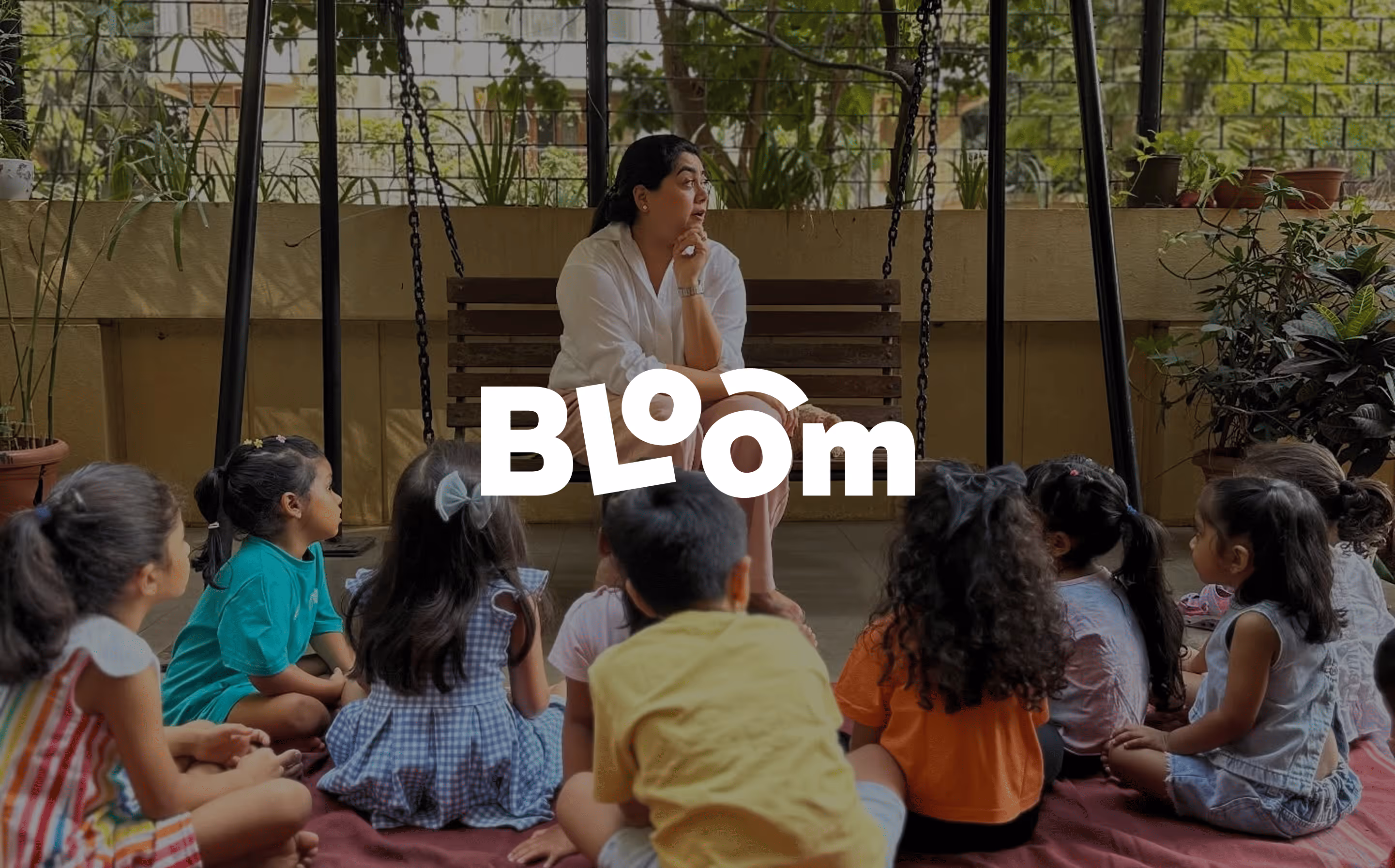
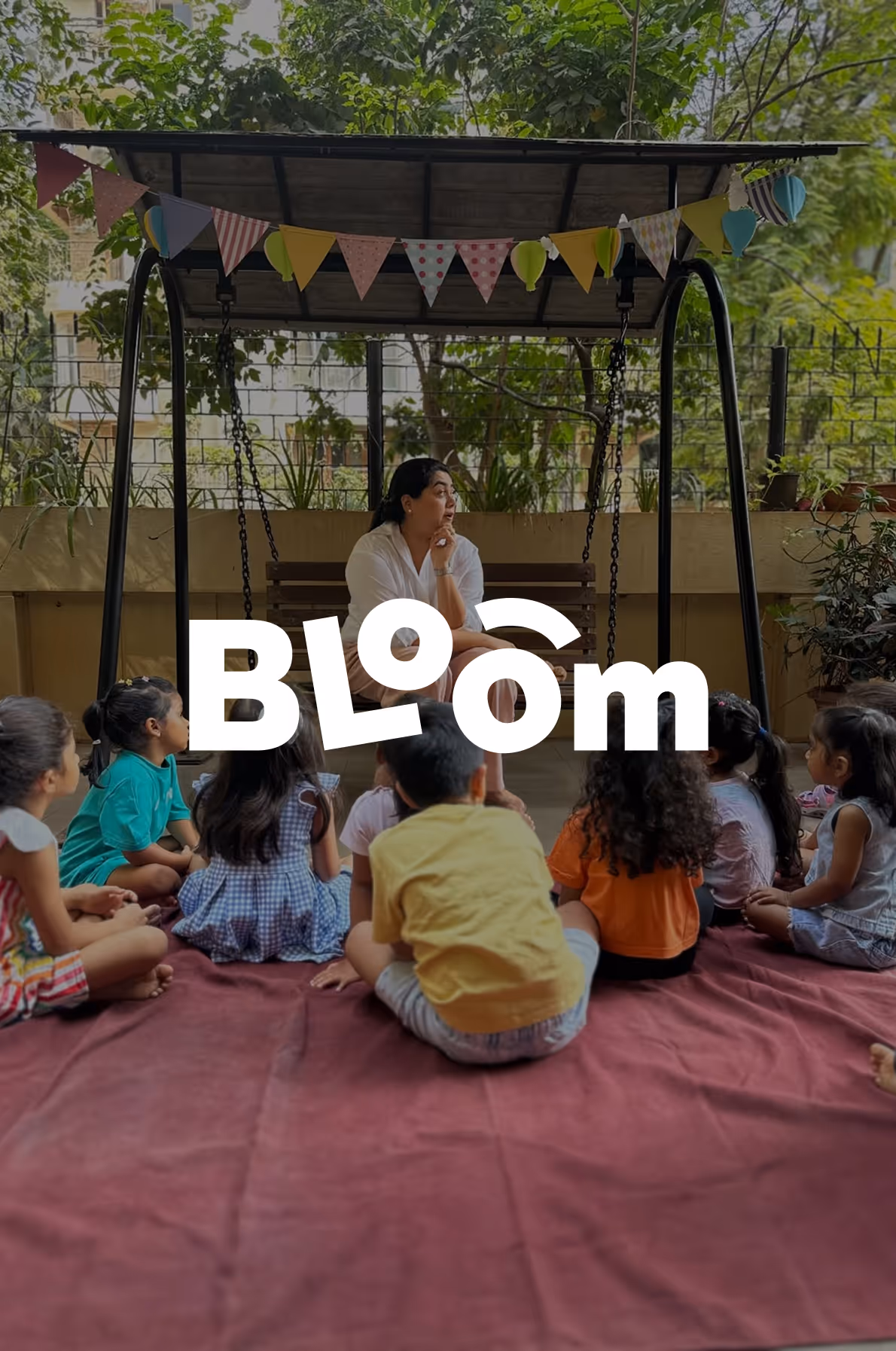
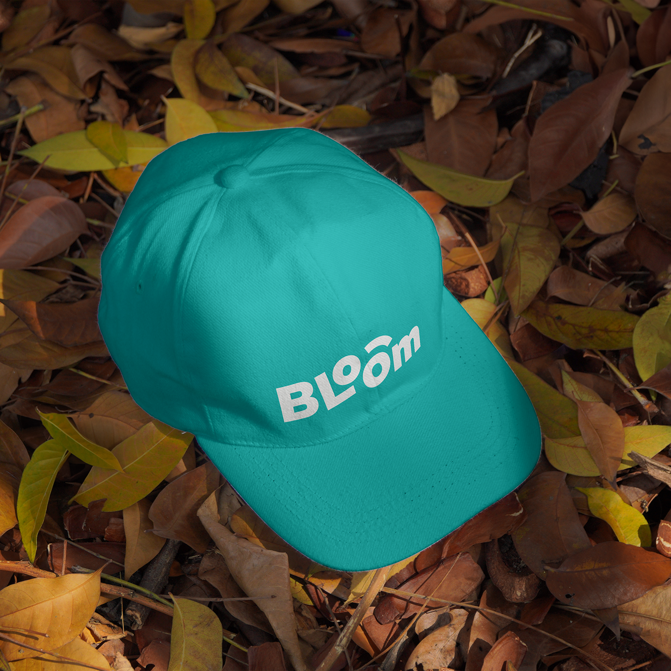
The Bloom wordmark is simple yet expressive. The tilted “L” adds a sense of movement and spontaneity, while the curved accent over the second “O” suggests imagination, growth, and a gentle sense of care — like a guardian over a child’s energy. The bold, rounded letterforms convey warmth and trust, making the logo feel both reliable and joyful.
(VISUAL IDENTITY)
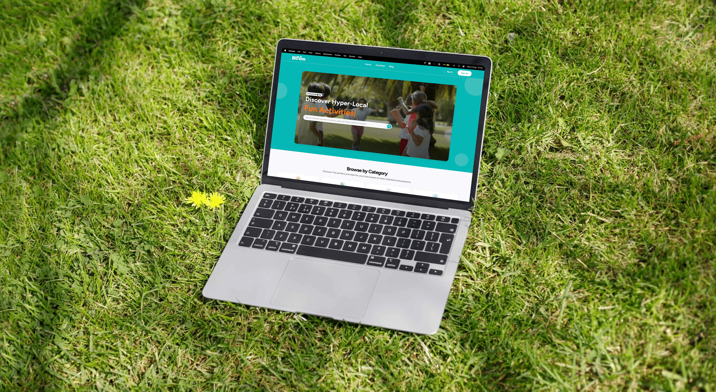
Bloom’s visual identity is designed to be vibrant, friendly, and easy to navigate — much like the experience it offers parents. Every element is chosen to reflect clarity, joy, and trust.
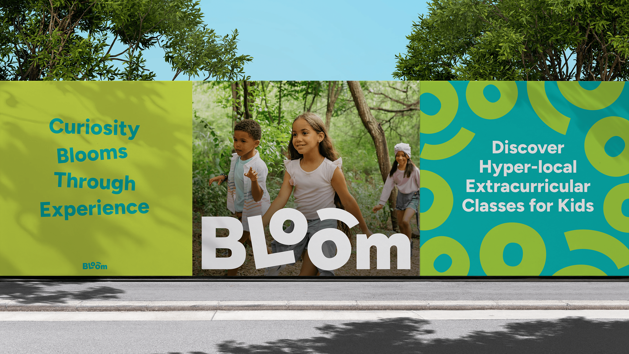
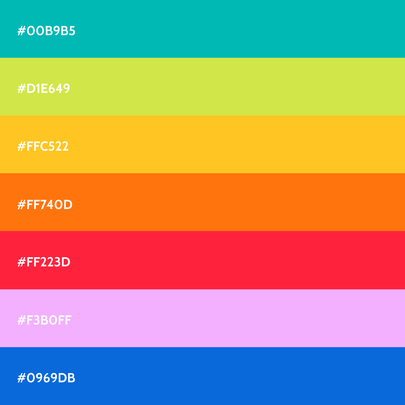
The colour palette is led by a fresh, distinctive teal, supported by black and white for contrast and clarity. A secondary palette adds energy, versatility and flexibility across brand touchpoints.
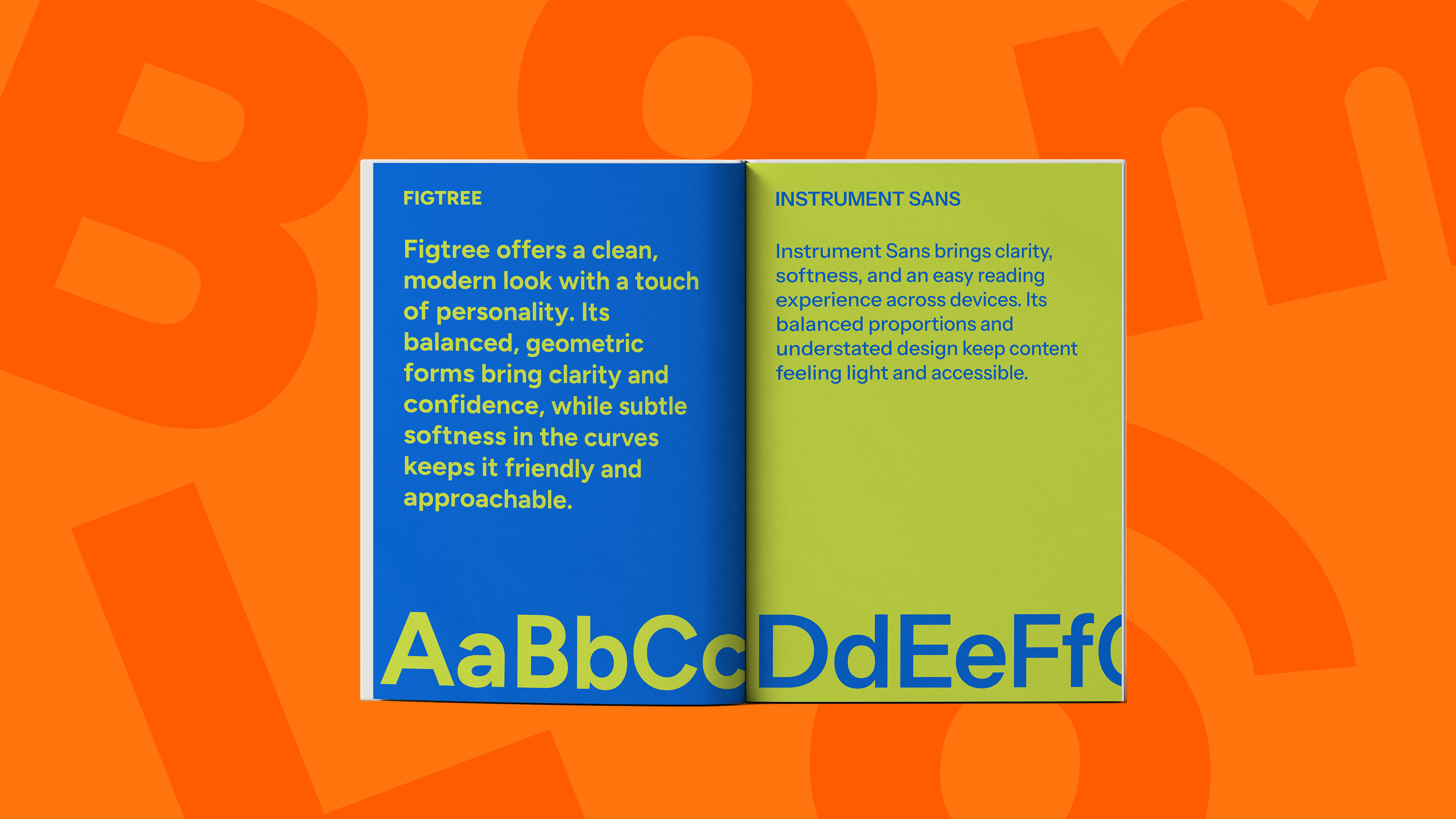
For typography, Bloom uses Figtree for headings — a modern, geometric sans serif with a warm, confident tone. Paired with Instrument Sans for body copy, the type system feels clean and approachable, making information easy to digest while adding subtle character to the brand’s voice.
The colour palette is led by a fresh, distinctive teal, supported by black and white for contrast and clarity. A secondary palette adds energy, versatility and flexibility across brand touchpoints.
For typography, Bloom uses Figtree for headings — a modern, geometric sans serif with a warm, confident tone. Paired with Instrument Sans for body copy, the type system feels clean and approachable, making information easy to digest while adding subtle character to the brand’s voice.
(brand extension)
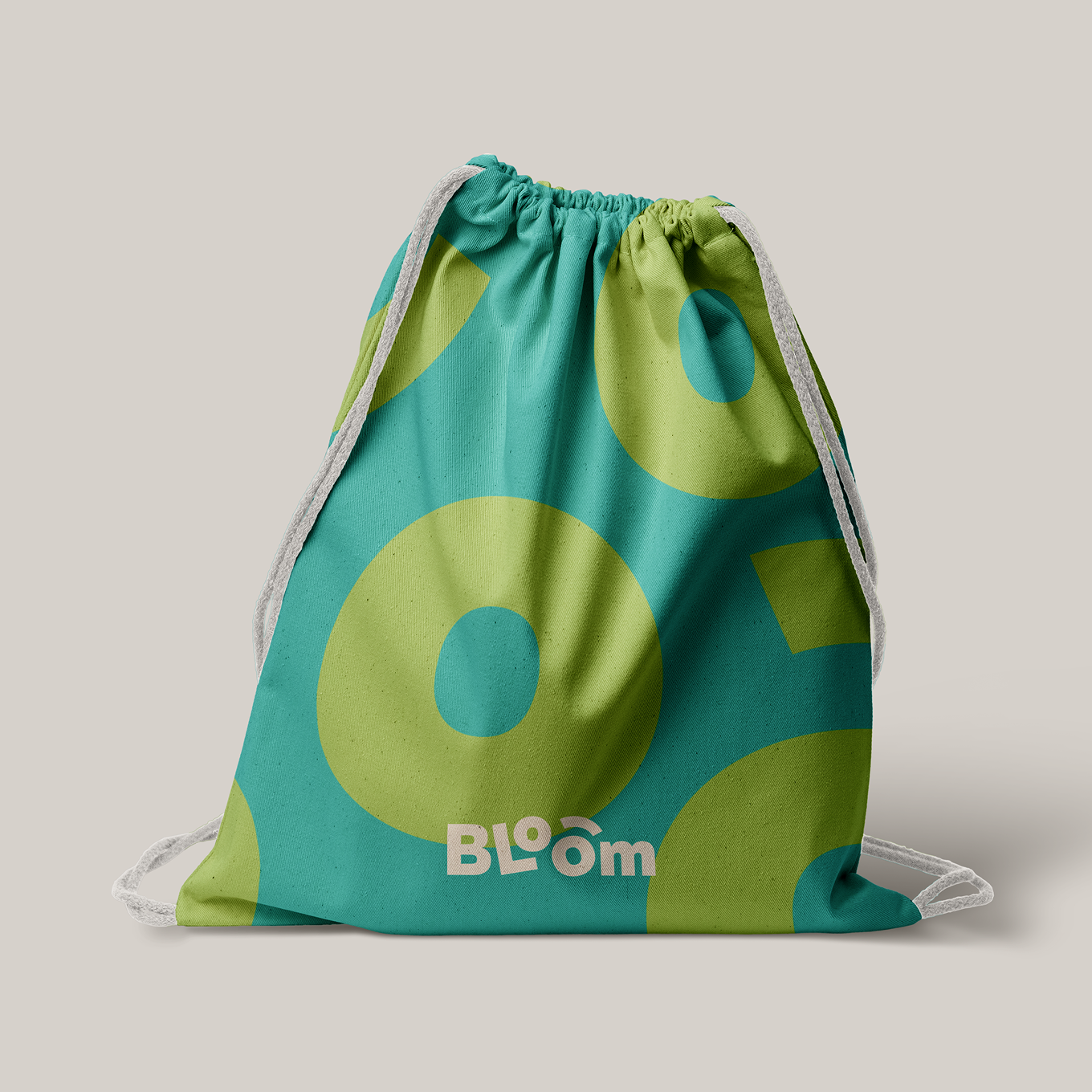
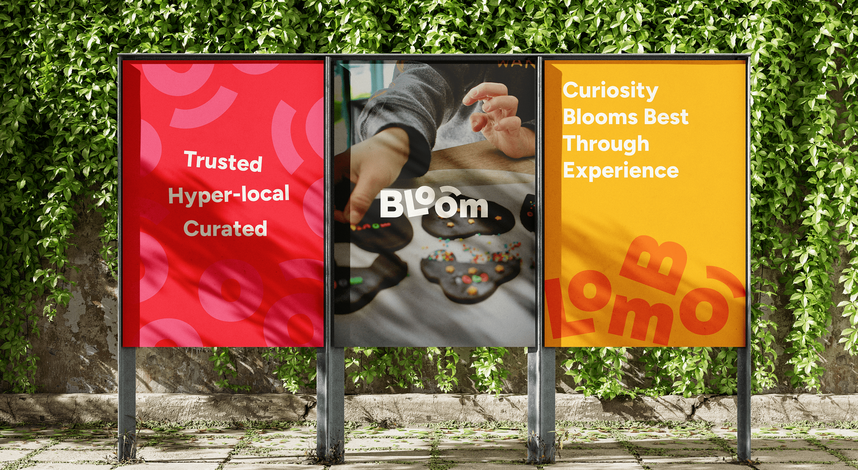
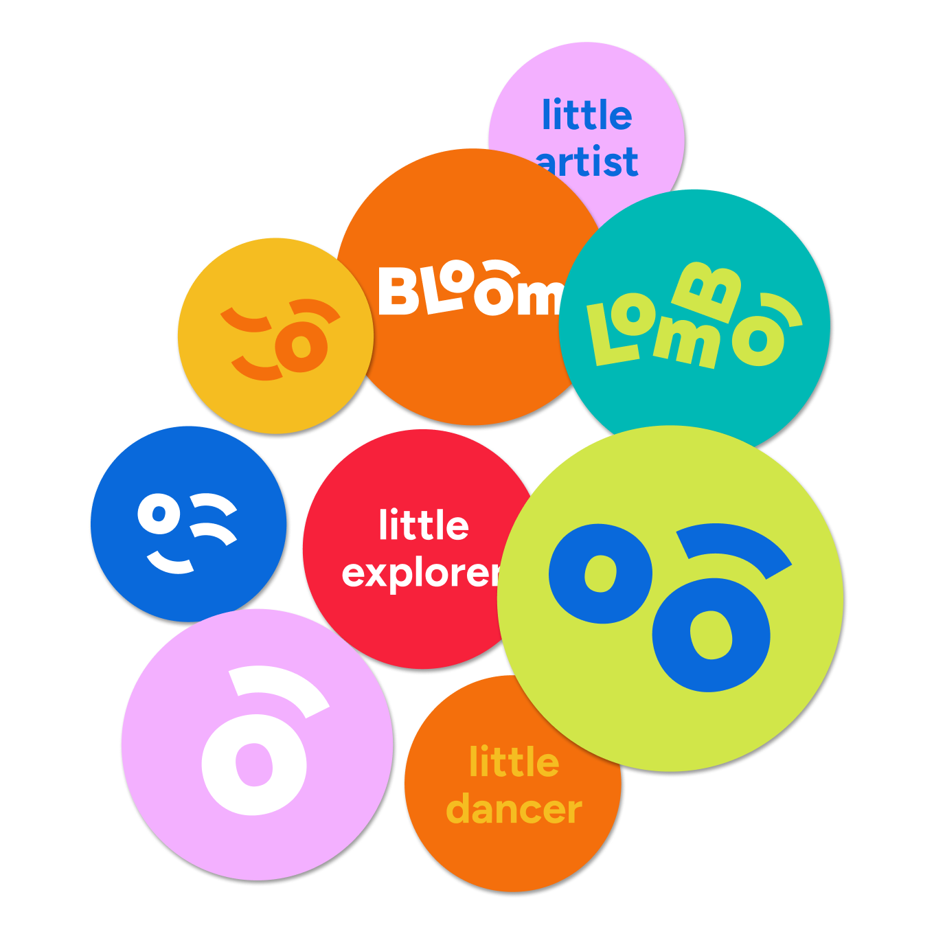
To guide future brand applications, we created a reference board of visual cues and design directions. It features playful layouts, bold colour blocking, and elements like confetti and graphic "O"s that echo the logo’s spirit. These ideas act as a moodboard for extending the brand across print, digital assets, and the broader visual ecosystem.
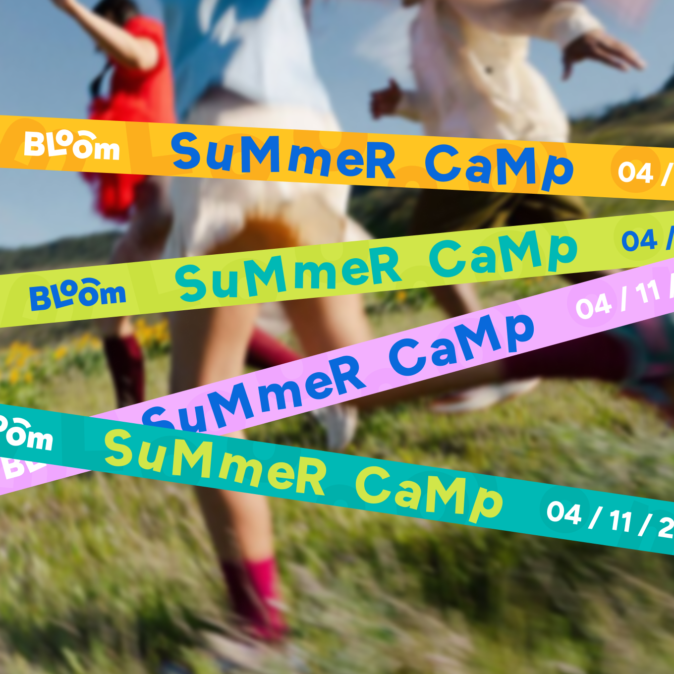
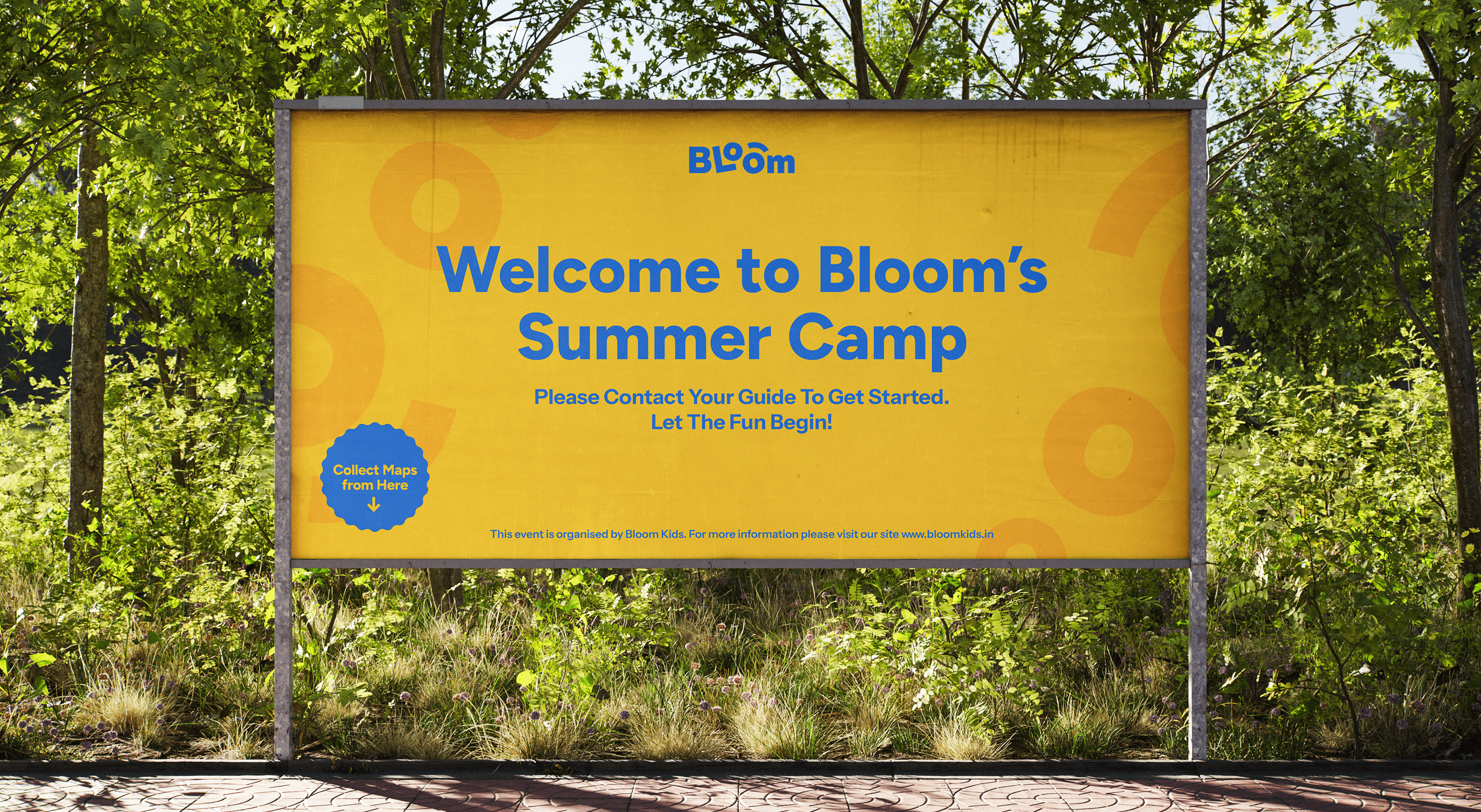
(social media)
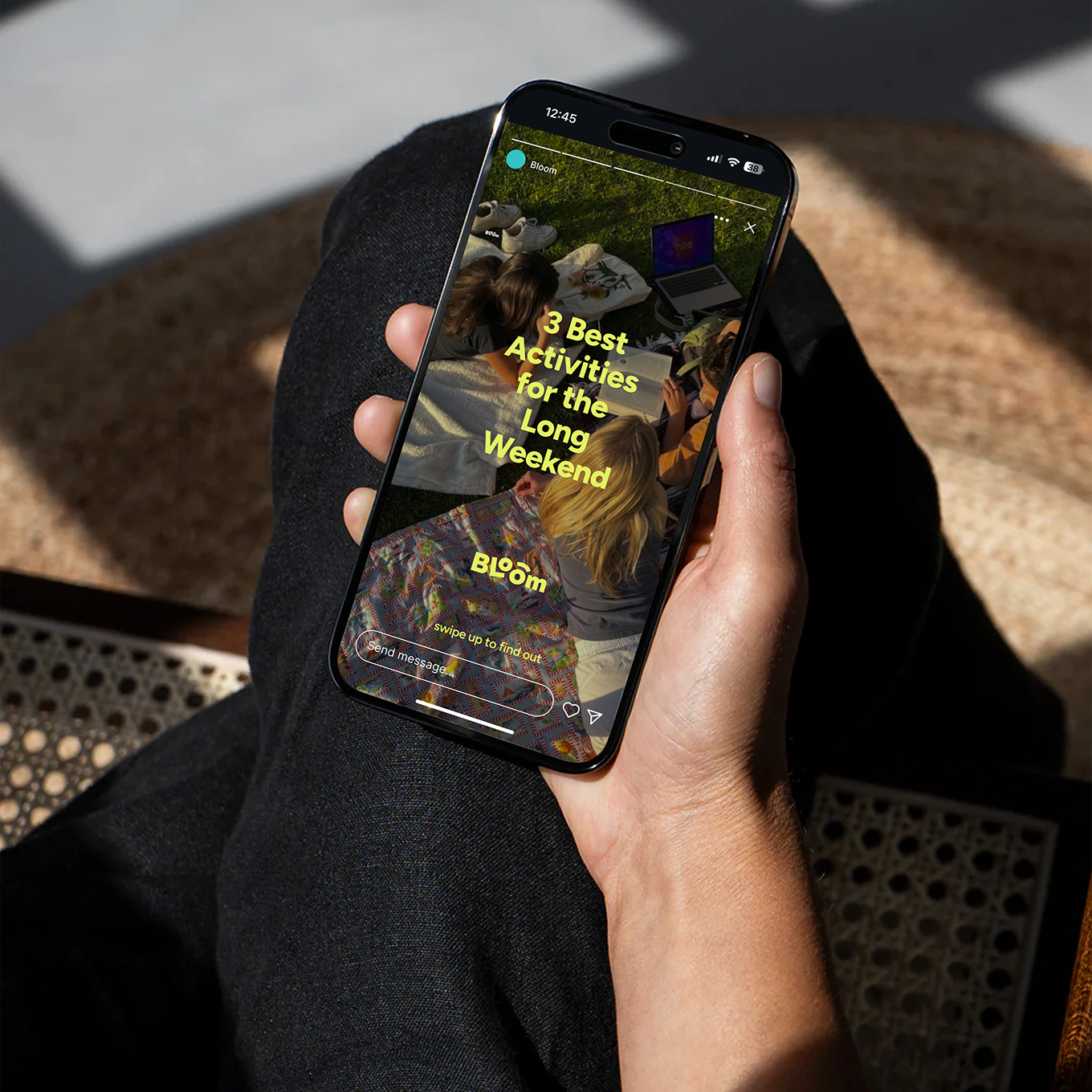
We approached social media as an extension of the product experience — clear, warm, and easy to navigate. The system is built around bold, text-led compositions that surface familiar parenting moments, making communication immediate and relatable.
It is designed to be flexible, supporting everything from class promotions and event announcements to testimonials and informative content. A subtle colour-coded framework organises posts by category, allowing users to scan and understand content at a glance — keeping the feed both intuitive and quietly playful.
It is designed to be flexible, supporting everything from class promotions and event announcements to testimonials and informative content. A subtle colour-coded framework organises posts by category, allowing users to scan and understand content at a glance — keeping the feed both intuitive and quietly playful.
(TestiMONIAL)
Working with Empirici Designs has been a defining part of Bloom’s journey. I partnered with them right from the stage when Bloom was just an idea, and they played a crucial role in bringing it to life.
From the logo and brand colours to the complete brand guidelines, every element was thoughtfully crafted. What really stood out was the depth of their process. They asked the right questions, took the time to truly understand the vision, the audience, and the purpose behind the brand.
I would highly recommend Empirici Designs to anyone looking for a team that has a very strong design sensibility.

SAMIKSHA MEHTA
FOUNDER, BLOOM
CLIENT TEAM
EMPIRICI TEAM
Isha Vora (Lead)
Athen Puthiyangath
Simran Satija
Samruddhi Godbole
Meenakshi Sisodiya
EMPIRICI TEAM
Isha Vora (Lead)
Athen Puthiyangath
Simran Satija
Samruddhi Godbole
Meenakshi Sisodiya
CLIENT TEAM

Harmony Gardens
Brand Strategy / Brand Identity / Print Design / Website / Spatial Graphics

Amardeep Design
Brand Strategy / Brand Identity / Communication

Ittiyera
Brand Identity / Communication / Packaging

State of Architecture in South Asia
Brand Identity / Communication / Exhibition Design
Amardeep Design
Brand Strategy / Brand Identity / Communication

Freshot
Brand Strategy / Brand Identity